Life as a teen can be difficult at the best of times. I remember, it wasn’t that long ago. Only like ten years really. So when this project came up at JFMD, I was excited to take it on. We Need to Talk (WN2T) is a program run by Jewish Family Services with support from JFMD to help teens throughout the Detroit Jewish Community by increasing awareness of mental illness, reducing stigma, and improving access to services. They hold events, release videos, publish articles for parents and students, and make resources available.
The brand identity was already developed by fellow art director Bruce Agababian, and a version of the site designed by the previous UX Designer was online already. I took what Bruce made for WN2T print pieces and brought some of that mid-century sensibility and aesthetic to the site.
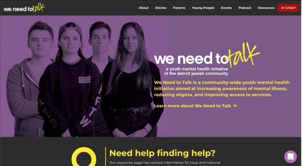
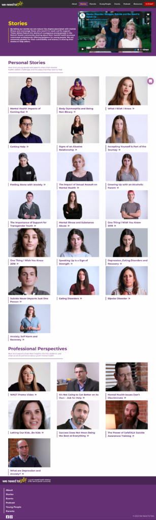
The audience for this site was split into two groups: parents and teens. Under the best of circumstances, these two audiences might get together and talk, but in any case we wanted to give them semi-separate channels in which to find our content. This resulted in splitting a lot of pages into parent and teen sections.
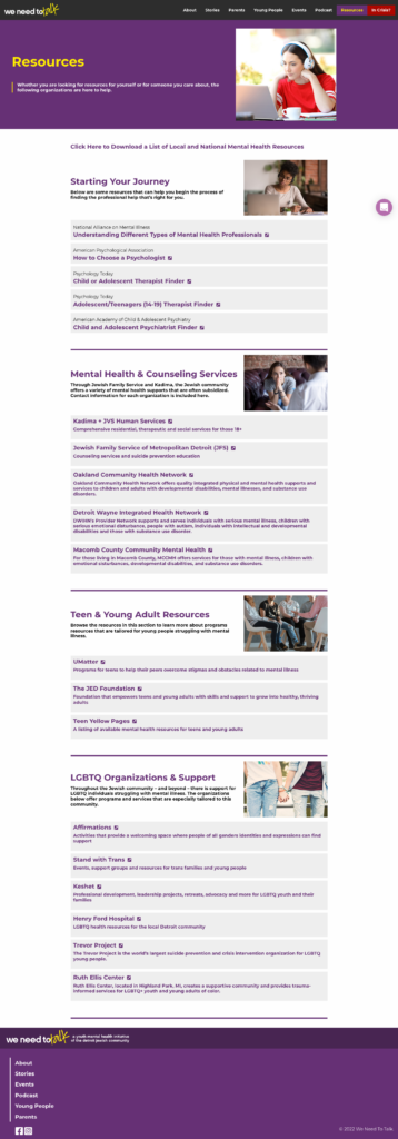
In the previous version, the “In Crisis?” option on the nav just pulled down a tooltip with the National Suicide Hotline. I felt this was beyond insensitive to someone who might be in a position to click that link, so I insisted that we put up a whole page with those kind of resources. It needed to be a page unto itself, even if it only had a couple links. We owed them that.
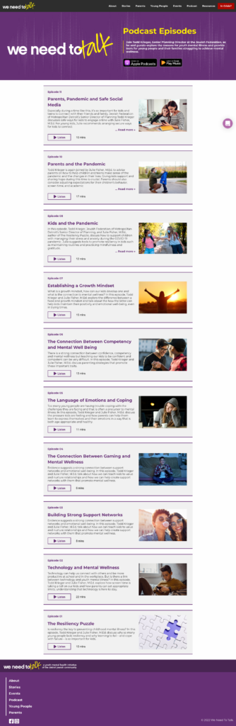
We also launched a podcast. Twice and a half. It’s good content, but the release strategy was lacking. I reckon we could have gotten some substantial listenership with a weekly release schedule and a little social media push, but the individuals in charge of the project wanted to put them all up at once, under the impression that the episodes would be discovered mostly through the site itself instead of a podcast app. Since we went with that approach, this has indeed been the case. We also re-launched the episodes, twice, in bulk. As the sole subscriber to the podcast on Spotify, I found this baffling.
The basic structure of the site was already in place and not going to change much, so this was largely a restyling and re-configuring of the site. But it was necessary.
This site was built on WordPress with Foundation. This was just prior to the release and mass adoption of CSS grid, so this was more of a flex-based theme with Foundation providing a pseudo-grid. If I were to make it today, I’d skip the Foundation part and go straight to the editor and add the grids I need myself in the CSS file.
I started by finding similar teen-focused non profit websites, including local ones like UMatter and BBYO, but also national programs like Go Ask Alice, Love is Respect, and the Trevor Project. I drew up wireframes of the most interesting and useful parts of those sites and figured out some ways that we could use them for WN2T content. I then made the best of these into mockups, discussed them in detail with the admins of the program, and eventually got a set approved. It’s not as bold as I was hoping, but it’s definitely better than it was.
The goal for this project was to connect teens and parents to a variety of mental health resources and content. I chose to start with a taste of each content type on the front page to let first-time users sample the variety: podcasts, videos, articles, events, etc. And then at the bottom of each individual post page, I put a randomized related content section to cycle users through the content and make more of the site easily discoverable.
The build itself was pretty straightforward, it’s a template theme and the templates were well-defined. So I learned a lot about queries and editing templates in PHP on this project. Effectively, this site was made using a custom WordPress theme that called on the JavaScript and CSS of the Foundation framework for styling. Then I put another CSS doc on top of that. And that’s how we used to do it back in 2017 before the Gutenberg editor and block themes changed WordPress development significantly.
The videos were key to this project as well. It’s important that teens see themselves in these stories and that they see figures of authority telling them that it’s okay to feel how they do. A huge part of this work is simple validation. People are super isolated these days, especially teens. And that means that these teens don’t know that others feel the same ways they do. And they don’t always know where to reach out for help. Or that help is even available. Some don’t know that it’s not a sign of weakness to ask for help, but instead a sign of strength and wisdom. That’s what we’re trying to do with WN2T.
We also made up a Covid-specific resources page a few years later in 2020 to help deal with that extra isolation and that page had some substantial traffic with social media pushes and links from the front page as well as the main JFMD channels. Resources are important, and making them available and easy to scan is super important, but none of it matters if nobody visits the site. Social media marketing and website traffic are intimately linked and need to be used together to ensure success. WN2T has taken on a more substantial social media presence and has been able to reach more teens and parents because of it.
We did some good work here and I hope it helps a lot of people. We Need to Talk is a fairly comprehensive set of resources for teens in the Metro Detroit area, particularly in the Jewish community. Though, having gone through the content, this site is for everybody of all cultures and beliefs. Some things, like the struggles of being a teen, are just universal.
I learned a lot about managing opinions and expectations and balancing the people involved in a project. I also learned a bit about how to present and talk through my ideas and use research to support my decisions. Sometimes a client’s gut feeling can actually be validated, if not quantified, with existing user research papers. Sometimes they’re way off the mark and you need to use that research to explain how visitors use the site and how to use the flow of the site to achieve your objectives. But most importantly, you always have to keep your goals in mind: in this case, helping teens. In every structural decision I made, I asked myself whether or not that choice might help a teen get the resources they’re looking for. For each design decision, I asked whether it helped or hindered a user’s quick discovery of content. There’s a lot of good stuff on this site, my challenge was to make it all accessible. I think I did alright.