The Jewish Federation of Detroit (JFD) is an organization supporting a number of Jewish charities in the Metro Detroit region. They fund-raise, organize, and provide administrative, marketing, and other services to its various constituent nonprofits.
When I arrived at JFD, the main website was a bit dated. When a large website grows and changes with its audience and users, it eventually accumulates a sizeable amount of tech debt. There are extra features that dead-end for lack of interested parties. There are outdated paradigms and structures that previous employees made, which probably made sense at the time but are now out of context in the current iteration and use of the site. This is a natural point in the life cycle of a large site and about the point where you want an overhaul. The web is always changing, along with the way we use it, and a site can only respond to those changes for so long before its owners have to start taking a more proactive approach.
JFD had a great brand identity going already, so I didn’t need to ruffle any feathers organizationally, just make the site more usable. They had the tools already: Gotham and Baskerville as the fonts with a nice geometric international-style logo and a couple shades of blue that played nicely together. As I’ve gotten older and wiser as a designer, I’ve realized that sometimes it’s not worth the trouble to reinvent a wheel that’s already perfectly fine. Working with existing systems instead of against them has been a huge lesson for me and one that I’m always trying to incorporate into my work.
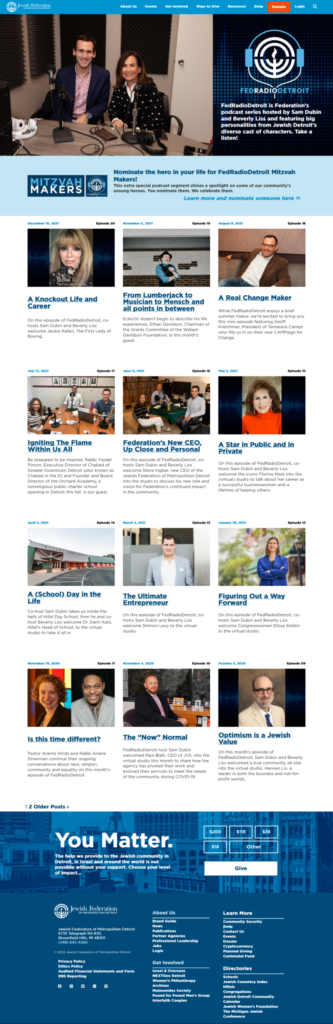
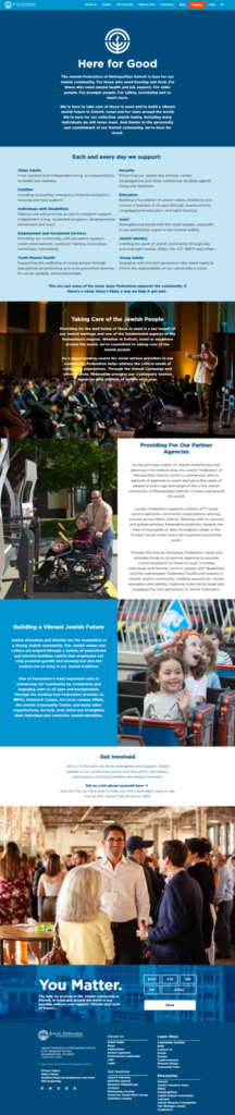
In my time with JFD, I learned a lot about the huge variety within the Jewish community. There’s a vast range of needs and priorities throughout the community and the Fed (as we affectionately call it) is supposed to encompass them all in one way or another. In light of that, we decided to divide up our audience by intention: people looking to donate, people looking for help, and people looking to get involved or attend an event. The puzzle of this project was streamlining those user flows while also giving the user ample opportunity to jump off that beaten path, explore, engage, and possibly find their community. It also had to visually represent the organization. The photos taken by our resident photographer were key here in helping people see themselves in our groups and at our events.
JFD has been around for nearly a hundred years at this point, so there was already brand recognition in the community as well as decent traffic coming to the site daily. The goal here was to make it easier to donate and to register for events so that more people might do so.
A good website always starts with inspiration and discussion. We looked to some other Jewish Federation websites to see how they approached these issues, and that was somewhat enlightening. We realized that we needed to look quite a bit further out into the nonprofit world to see examples of the solutions we were seeking. We took inspiration from Volunteers of America, The American Cancer Society, Project Rubicon, and others.
We then discussed the goals of the site: drive donations and event attendance. It wouldn’t however, be so simple as to put a donation form up top and list out all the upcoming events beneath; there were other considerations. First off, we didn’t want to make the site too different for our frequent visitors. Second, we wanted to use the top splash as a billboard for major upcoming events, since those grow the community and bring in donations. And third, we wanted to spend some time up on the top of the front page explaining what we do and our mission, with the option to play a video. I began to think of this front page as more of an exploratory experience, as opposed to a traditional straightforward narrative structure.
We also came to the realization that our audience needs to see themselves in the images on the site. This is when I devised the persona carousel:

I’m not usually one to propose a carousel, but I’m taking the “discoverability” approach here, letting the user click and drag and scroll or swipe their way through a series of images representing the various departments in the organization inviting them to get involved. This solution also put more pictures on the page, and these authentic community images were key to making the whole site work visually.
Moving along, we get to the donation page. This one was interesting because there were so many ways to donate. It’s not just a matter of monthly or one-time, there were also tributes, payment plans and pledges. We had been treating these all equally in the previous site and the general consensus is that we should keep it the same here. In retrospect, maybe we should have made one-time donation the default with a prominent option to convert to monthly, with payment plans and tributes relegated down to the bottom of the donate component. I think I’d also move that whole assembly up to the top of the page, probably on the right side, opposite that image or text. But probably not both, that’s too much “unproductive” real estate before the user actually gets to the function of the page and I suspect it’s a (small) source of friction.


This is a large site, so if you’ll indulge me, I have one more page to show off: the departments. This one was a fun challenge because I needed to make some common structures and templates for departments that were going to have content that wasn’t totally consistent amongst those pages. They all had a mailing list, and introductory paragraph and events, but from there, the content and priorities diverged. So we made an accordion-tab block that each department could use as they saw fit.
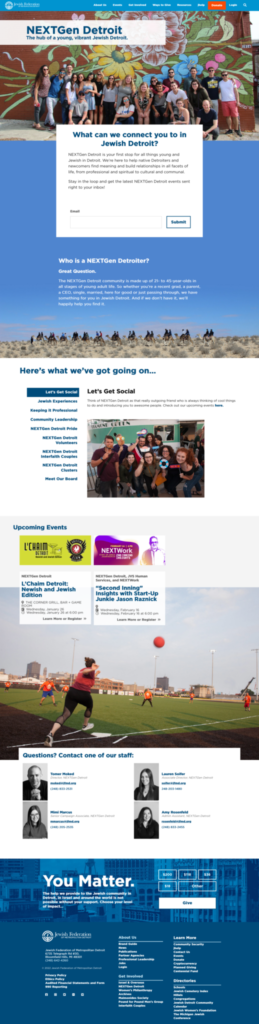
The NEXTGen page (under 40) lists out their programs and has some info about the board and the offerings of the department, with an emphasis on getting involved in the Jewish community. Women’s Philanthropy had similar needs, but was a little more focused on what they could do for the visitor to help them in their career. The Special Interests Group page just lists out the programs they offer, and the Israel and Overseas department needed a whole different setup. Luckily we built this new site on a heavily modified version of the “Twenty Nineteen” base theme, which was a hybrid template-block theme, and I was able to make up the columns they needed.

What about Archives, you ask? Well, there was so many great archive photos and their director is a joy to work with, so I whipped up a little something special.
All the custom blocks were made by taking a JS utility (Flickity, Tabby, etc), working with the backend developer to integrate it into WordPress with the Advanced Custom Fields plugin and some clever PHP (thank you Herb), and then I took that working prototype and styled it to fit the page. To say I learned a lot here would be a massive understatement.
This was, and still stands as, the biggest, most complex site I’ve ever made. But it was a collaborative process, which helped immensely. I had other art directors to consult when I felt something wasn’t working, I had an effective manager who cleared out the time for me to make this happen, I had a great creative director who listened to my ideas and took a lot of them into consideration, and most importantly I had my backend dev, Herb Hanson. I would like to thank all of these people for their patience, vision, and skills, without which this site would have never gotten made.
I’m very proud of my work here, even as I see little things to fix that pop up every once in a while. Websites are living, breathing systems, and that’s why developers offer maintenance plans. Or why marketing departments hire web staff. I added so many tools to my kit, including SCSS/SASS, some more JavaScript, flexbox, CSS variables/custom properties, and CSS grid. This site was a long time coming, but we built it to last and grow with the Fed and change with their needs.